Initial concept art
- Kres Raven Bosales
- Dec 4, 2023
- 4 min read

Updated: Dec 11, 2023
idea no.1

notes:
The white drawing is to resemble something like footprints in the sand. The idea doesn't have to be footprints but something diagonal and in perspective? Perhaps words can be used instead, or include both? To be explored.
The size of the characters is deliberate to resemble growth from a young age.
The arrows are added to make the piece more dynamic.
During the creation of this drawing, I reflected and noticed that I practically had no space to incorporate the doodles. This would be the case if the composition fully included the characters, but what if I staggered and individually show their appearances? This would give me space to draw the doodles, though I wonder if this would make the arrangement of characters other than yellow feel out of place? To be explored.
inspiration


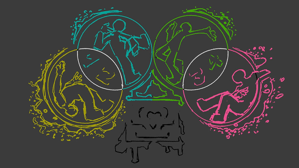
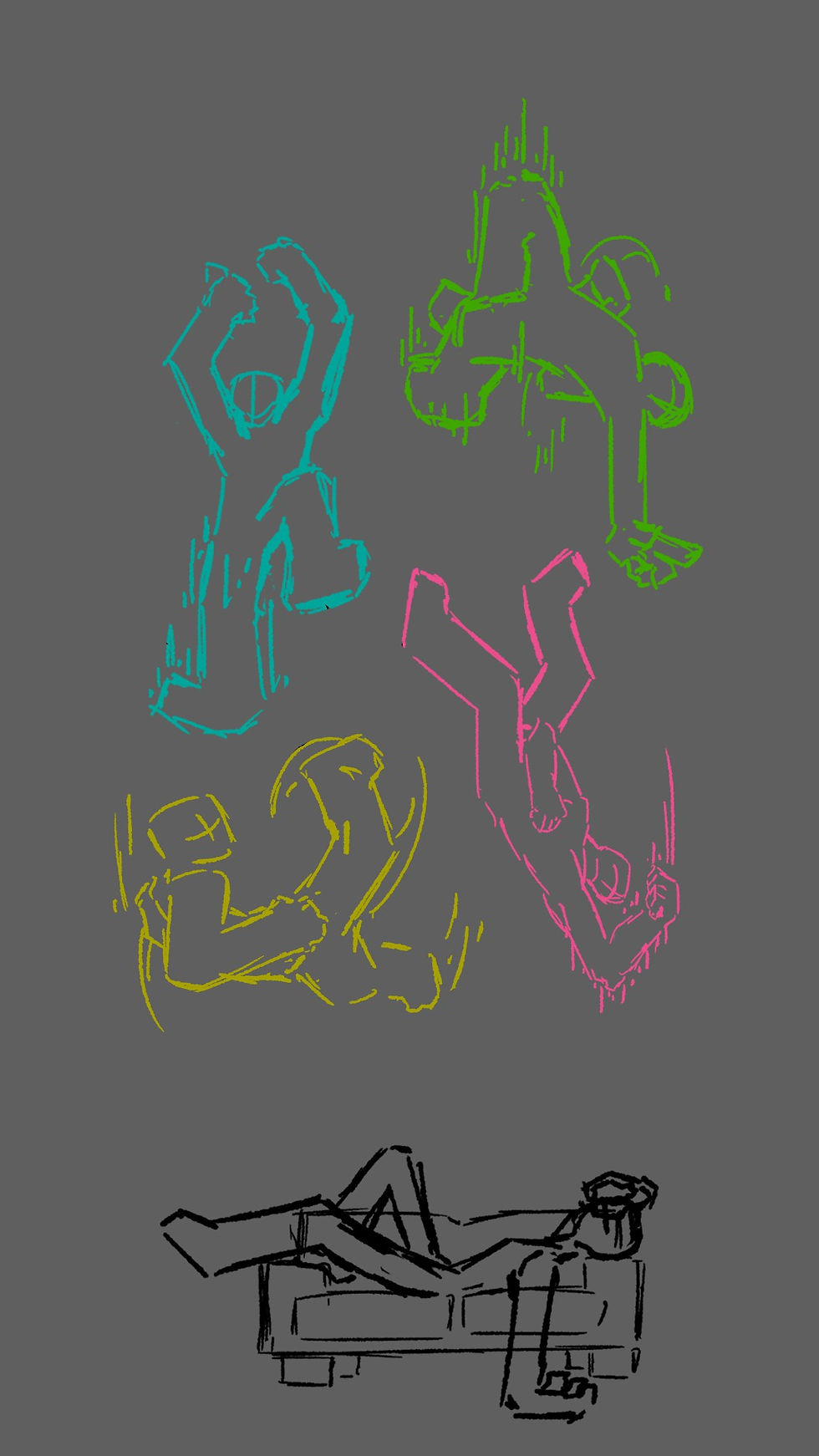
idea no.2

notes:
This is the piece that I had in my mind when I was writing my essay draft.
Floating in space composition. I really like the poses shown on here though I don't know if that is my anchor bias or not. I should explore more variety in poses. To be explored.
There are supposed to be doodles in the background. Perhaps I could have a single background of doodles and just color-coordinate that with the characters? Perhaps have those colored doodles visually pop and out? Perhaps change the doodles with each character being shown? Lots of possibilities. To be explored.
Gained inspiration for a new idea: each separate character with their own background of doodles and color. This would be a 'color card'. Each card can be appreciated individually, or done so as to slot and therefore combine with other cards to create a composition. To be explored?
inspiration

(stop motion for the photo above)
idea no.3
notes:
This is my current favourite piece. I like the dynamic poses, the color, the graffiti spray, the circles, the cool visual of the numbers, and the symbol in the bottom middle within a box frame outline. I am feeling a strong graffiti vibe to this which could be further enhanced if it were to be a final piece. For a concept art I could do a bit more but this is the most fleshed-out piece I have so far.
The idea behind this was stamps, hence the circles. Looking back at this work, the color-coded numbering helps to deliver this idea across too perhaps.
Had a lot of dun doing the graffiti smears. I am a bit worried about making the piece too cluttered and visually jarring when I add doodles but I will have to see how that goes first. To be explored.
fun fact: that symbol in the middle in the frame are initials of my name, KB but drawn sideways. Two lines and a heart. Pretty cool right?
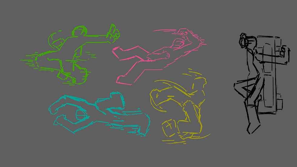
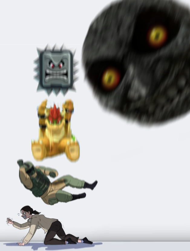
idea no.4
notes:
Having fun with the idea of space so I made the characters fall, or rather drop instead. Seems funny to see "this moment before chaos".
I noticed that I had a lot of styles when trying to create this so I somewhat honed on a certain blocky style. The aim is to focus less on detailed anatomy and more on form I think (shown by how different the pink character is compared to the others).
The smears on the actions helps to convey the movement and make it more dynamic. I don't know if I will include this in other works but it is still a good stylistic option to include perhaps. To be explored.
A different approach from landscape to portrait which I think is cool to explore on. To be explored.
inspiration
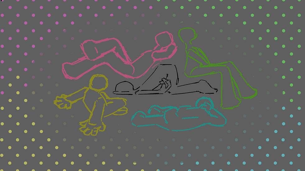
idea no.5

notes:
the idea behind this leaned more towards the "stamp" idea. I planned to have perhaps a character as seen above doing something, and they are placed within a background. While I do find the simplicity in the current visuals nice, perhaps I could develop it more. To be explored.
coloured character are identical models but different colors. Current arrangement as shown above are done for the sake of understanding the work, but in practice could be arranged to be more scattered and chaotic. Developmental images to be drawn.
inspiration

idea no.6
inspiration
notes:
work in progress
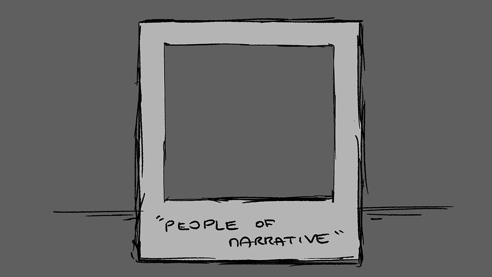
The idea is based on graffiti art being placed within reality. Leaning towards the influence of character select screens in this concept.
subtle/not too complex backgrounds, serves to only enhance the "stamped" characters wherever they are placed.
The photo above is aimed at including the characters within the polaroid frame.
The photo below similarly follows but with less emphasis, and aims to establish a difference in reality? Subtle simple backgrounds extend past the polaroid frame.
the name is a reference to narration perspectives, i.e first person, second person, third person. I chose this name because I usually include about four characters within a work but it would be without context if I were to use, say, "fourth person" as the title. Hence, it is the way it is.
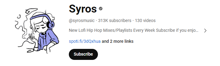
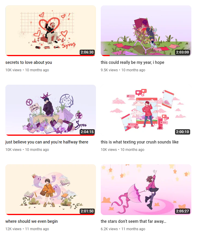
inspiration: from youtuber "Syros"' thumbnail art.


idea no.7

notes:
In this idea, I went with having the coloured characters form the shape of the guy in the middle, meant to represent me. The dots are temporary placeholders of the spacing for the doodle background.
I can't tell if it is because of the lack of doodles or other more stylised elements such as what I did with arrows and graffiti, but this piece feels incomplete. I think it's more apt to say that it isn't executed in the way I expected to yet.
I also went with the idea that the piece could be done in a way that each character have their own respective card with their own respective colour and doodle. Of course, the other characters AND the man in the centre will be absent and replaced by the relevant doodles too, maybe.
Work in progress, but more developed. Seems like a similar approach with idea no.2
idea no.8

notes:
had a creative blast with this idea. Seems more like leaning into self-fullfillment drawing but there is potential in here, despite how different it is.
I got inspiration from looking at real life art, like the cool medicine boxes of the week I found for reference.
concept was: piano + printer ink toner + typewriter
the hands...they initially were meant to be similar to piano-playing but, I think it is fine the way it is.
inspiration

(planned to draw the piano is this angle but more in perspective)


Comments