[WEEK 15] Progress Report 2
- Kres Raven Bosales
- Nov 18, 2024
- 2 min read
I have been feeling lost and confused on how to approach my work so far. The 3D layout feels limiting every time I look at it - it feels like it causes too much ‘spatial awareness’, in how neat the environment looks not matter the perspective. While this isn’t so bad per se, I do feel frustration in not being able to achieve levels of “warp” or aperture for a shot that I wish to have; I have a certain idea, a vision of what it may look like but it feels like I am running into dead ends.
Update I: I have taken the opportunity to ask my fellow peer for their feedback and assessment on my current work. I agree with most of their constructive comments, such as giving the room a life and personality to it (such as with colour), enhancing the “star” theme of my story with links to the environment (such as close-up shots of the glow-in-the-dark stars by themselves), and doing more tests involved with the 2D aspects (such as backgrounds and rough animations).
I appreciate the feedback given to me as I learned that there is a need to step back to look over the work so far, especially from an outsider’s perspective. I learned that my current progress would continue to delve more and more into the 3D modelling stage the more I obsess over with the details, making it feel more of a priority over 2D animation, the main method I would use for storytelling.
One particular feedback that I will set out to do moving forward is to explore colour schemes, explore how the animation sequence would develop, and explore creating the vision that I want, in 2D this time. After all, the 3D was supposed to be a guide and shortcut to save myself the effort of having to worry about perspective, lineart and continuity.

Progress Images
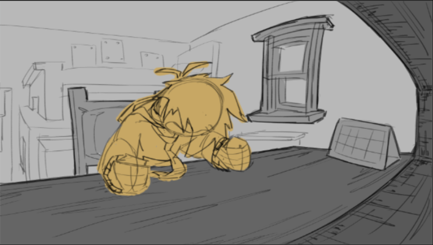
Image 1 - exploring how to recreate environmental shots in the storyboard in 3D

Image 2 - exploring redrawing the space in complete 2D (in my own style)

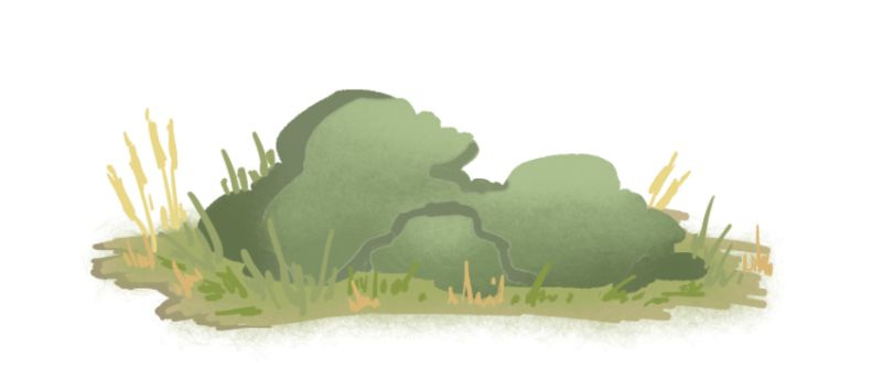
Image 3 - exploring how to draw in the style of my aesthetic inspiration/ mood board (pinpoms on instagram)

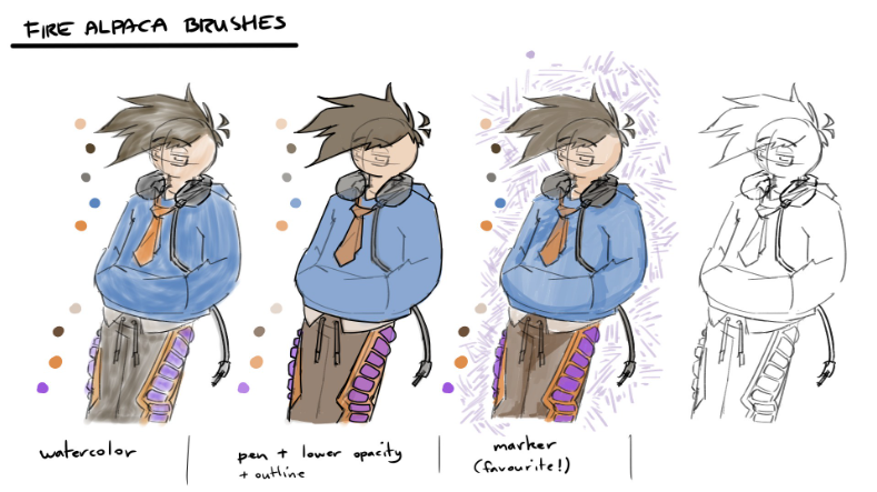
Image 4 - Exploring brush styles based on my aesthetic inspiration/mood board

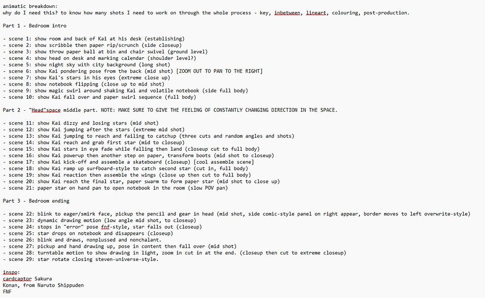
Image 5 - shot list of my story


Comments